
A recent article on sportingnews.com shares an inside look at the transition from “Mighty Ducks” to simply “Ducks,” and to imagine what might have been.
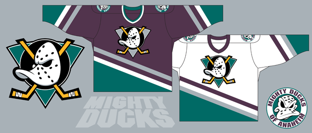
The Mighty Ducks of Anaheim entered the NHL as an expansion franchise, beginning play in 1993-94. Owned by The Walt Disney Company and named for Disney’s 1992 movie of the same title, the Mighty Ducks employed an eggplant purple and jade color scheme and a decidedly Disney-esque logo.
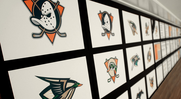
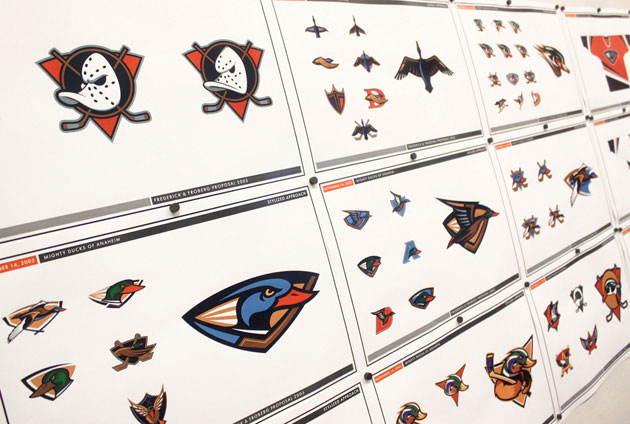
The logo was created by Disney artists Tony Cipriano and Fred Tio, the end result of a process which saw 500 to 700 ideas submitted by Disney employees. Mighty Ducks general manager Jack Ferreira said the original planned color scheme was purple and gold, “but that looked like an Easter egg, so we eliminated the gold and replaced it with silver. We wanted something totally different, totally unconventional.” They certainly got it.
The logo embraced many of the visual trends that came to personify sports branding in the early ’90s, all rolled out by Disney in an explicit appeal to youth and families. Disney’s marketing prowess was seen as a major asset by the NHL, then widely seen as a league in decline.
In February 2005, Disney sold the Mighty Ducks to Broadcom Corporation co-founder and Orange County resident Henry Samueli and his wife, Susan. One of their first major decisions involved a commitment to a total team rebrand, with “Mighty Ducks of Anaheim” giving way to the more conventional-sounding “Anaheim Ducks.”
In distancing the franchise from its Disney roots, Henry Samueli said “we wanted to be more traditional in terms of the name. In fact, it was a little too tied to the movie.”
Samueli decided to keep the “Ducks” name after the team conducted informal surveys which revealed that a vast majority of season ticket holders favored it. “If you have to change the name,” he said, “you’re wiping out 13 years of brand history.”
The Ducks selected veteran sports branding firm Frederick & Froberg Design Office to handle the project. The company, based in Montclair, N.J., today operates as Fanbrandz. Creative director Bill Frederick — a friend and colleague in our sometimes small sports design community — recalls that the design process took place starting in October 2005, the outset of an aggressive timeline that required bi-weekly meetings in Newport Beach, Calif., with team owners as well as the entire Ducks marketing and management teams.
“The initial design explorations covered all of the style approaches we had discussed as a way to ‘get it out of our system.’ It became clear that the owners and management didn’t want an angry duck, an animated duck, an aggressive duck, or an ornithologically correct duck — no matter the illustrative style,“ Frederick said. “None of these approaches resonated with the Samuelis’ vision for a classic but sophisticated update with a color scheme that showed competitive toughness and a tie to Orange County.
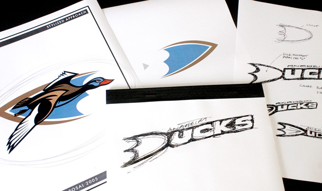
“Our discussion turned to eliminating an image of a literally depicted duck entirely, and we took a piece of one logo exploration that used a stylized duck foot as a graphic holding shape that also formed the shape of a capital ‘D.’ Henry and Susan immediately loved the approach of suggesting a duck without having to illustrate it. I sketched it as we talked, and when I showed them and the rest of the board room the quick drawing, they instantly said, ‘That’s it!’”
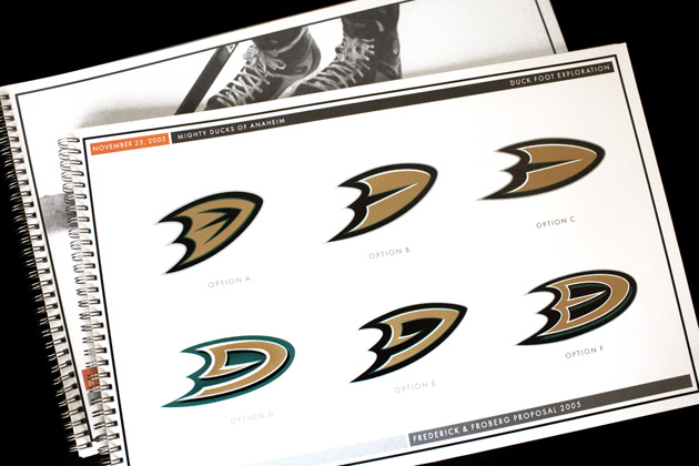
“Once we knew the direction we were pursuing, we experimented with many renditions of ‘D-feet,’ ” Frederick said. “We then engaged a public relations firm to execute a focus group of self-described “avid and casual Mighty Ducks fans” to gauge their response to the proposed new branding.” This took place in January of 2006.
Read the full article here
An Inside look at the transition from 'Might Ducks' to 'Ducks'
Related Posts