
![]()
A recent article on www.creativebloq.com shares an infographic that shares how the choice of colour will reflect your identity.
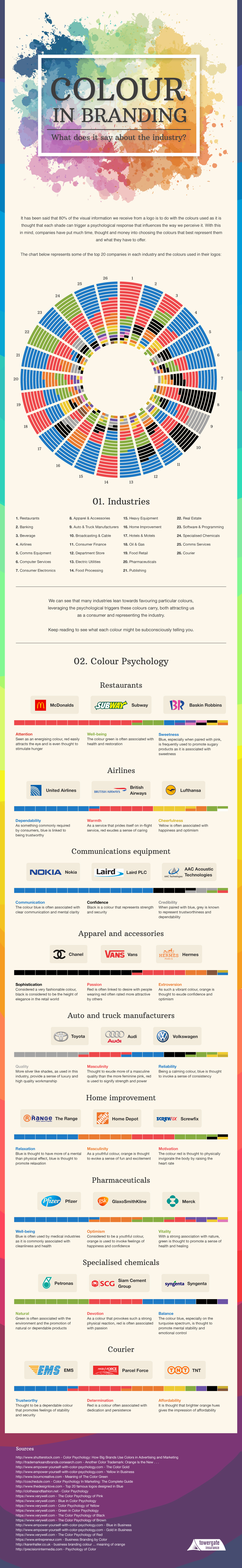
One of the most fundamentally important things to keep in mind when creating a piece of branding or logo design is the choice of colour. This is because behind each colour there are a set of associations which will communicate a subtle message about your business identity, as this infographic reveals.
Created by Builtvisible for Towergate Insurance, this vibrant infographic looks at the spectrum of colours in turn and demonstrates their connections to certain industries. For example, red is seen as an attention grabbing, hunger stimulating colour, making it the perfect choice for a fast food chain like McDonalds. Meanwhile blue is often associated with clear communication, so it makes sense that a company such as Nokia would use it to represent their brand.
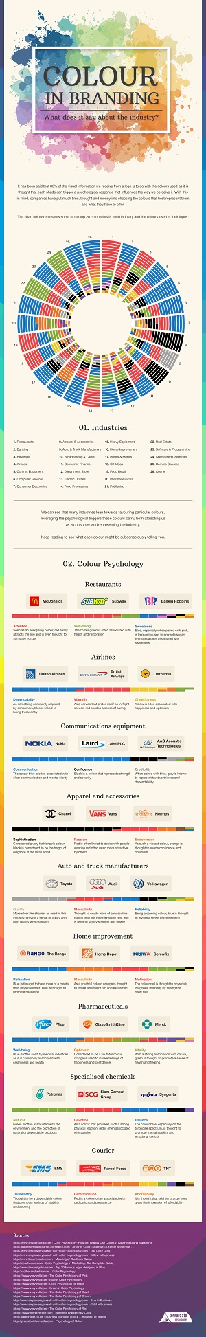
Click here to see a larger version of the infographic that can be zoomed in on.
Read the full article here.
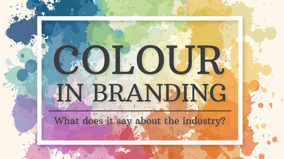
Colour in Branding
Related Posts