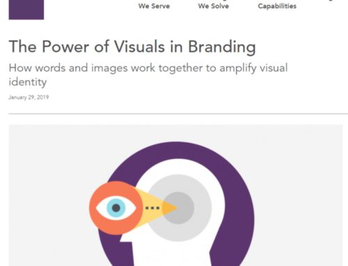


A recent article by Lori Slovik on the Domtarblueline.com looks at the psychology of color and its importance in branding.
When developing brand standards, considering the psychology of color is incredibly important. In graphic design and branding, color is utilized as an emotional cue—it has the ability to affect the viewer’s perception of a brand or product, and it has a powerful effect on a person’s decisions and behaviors. The use of color in business and marketing plays a significant role in how a company attracts their customers, so it shouldn’t be a surprise to learn that color psychology plays a pivotal role in design and marketing.
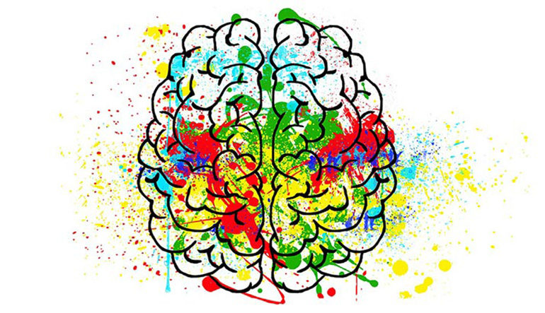
Are you wondering how colors can influence a person? Let’s take a look at some commonly used colors, the meaning behind them, and learn which colors industries often use to represent their brand.
Red
Red is a color that is often associated with passion, power, friendliness, excitement, urgency, strength, and movement. On the other hand, depending on the context, red can also portray fear, aggression, and terror. Red is also believed to stimulate appetite, which is why many fast-food chains frequently use the color red. Plus, the color red is considered to be appealing to children but yet can create a sense of urgency, which helps facilitate quicker customer turnover. You most commonly see the color red used for fast-food restaurants, traffic signs, and traffic crossings.
Yellow
Yellow is a color that is often associated with feelings of optimism, happiness, clarity, joyfulness, cheerfulness, and positivity. Yellow is a high-energy color and has the power to increase confidence and provide inspiration, so it’s no wonder major brands use the color yellow in their marketing efforts. Yellow creates a sense of urgency, and this tactic is often used to draw in impulse buyers. However, be careful about using too much yellow as it can create feelings of fear and anxiety. You most commonly see the color yellow used for fast-food restaurants, kid companies, emergency rescue vehicles, traffic signs, traffic crossing, signs, and window displays.
Orange
Orange is a color that is often associated with joy, warmth, enthusiasm, freedom, motivation, positivity, cheerfulness, playfulness, and optimism. But yet, in some cases, orange can trigger a sense of caution and anxiety, as well as suggest a level of bad taste and distrust. The color orange is typically used to draw in impulse buyers, and can also stimulate the appetite. You most commonly see the color orange used in fast-food restaurants, kid-friendly products, and for sporting events/teams.
![]()
![]()

Blue
Blue is a color that is often associated with reliability, peace, responsibility, calmness, tranquility, as well as security. Blue also has the ability to stimulate productivity and curb hunger. Typically conservative corporate brands that are looking to build relationships and promote trust and dependability in their products, use the color blue in their marketing. You most commonly see the color blue used for spas, workout facilities, government offices, car dealerships, financial institutions, technology companies, appliance stores, hotels, and hospitals.
Green
Green is a color that is often associated with growth, nature, life, power, balance, harmony, peace, money, wealth, tranquility, synergy, and health. The color green has the ability to relax people and is typically the color of choice when it comes time to promoting environmental issues, eco-friendly products, and economic exchange. Also, you most commonly see the color green used for coffee shops, stores, hotels, and restaurants.
Purple
Purple is a color that is often associated with respect, wealth, courage, decadence, spirituality, problem-solving, mystery, magic, luxury, wisdom, imagination, creativity, and royalty. Purple is often used to promote anti-aging and other beauty products, and often represents original, creative, and intelligent goods and/or services. Using the color purple is also a good way to evoke the feelings of having a quality product. You most commonly see the color purple used for luxury goods and hotels.
White
White is a color that is often associated with class, peacefulness, safety, spirituality, goodwill, purity, creativity, innocence, truthfulness, and cleanliness. If you want to represent the feeling of a new beginning and refreshment, then white should be your color of choice. Just make sure you don’t use too much white, as it can create the feelings of emptiness, isolation, and loneliness. You most commonly see the color white used for doctor waiting rooms, business offices, as well as for wedding companies.
Black
Black is a color that is often associated with intelligence, ruggedness, modernism, mystery, seriousness, strength, power, stability, elegance, sophistication, independence, and authority. If you want to have easy legibility and high contrast, then black is your color. But be careful! Too much black can create feelings of negativity, oppression, depression, and sadness. You most commonly see the color black used for professional and luxury products.
Read the full article here and see what brands leverage particular colors.
Brand Storytelling: The Importance of Color
Related Posts