
A recent article on fastcodesign.com looks at how Pantone became the definitive language of color.
A few minutes into the Wizard of Oz, Dorothy opens her eyes and surveys the Technicolor world around her. Dorothy follows the Yellow Brick Road, she arrives at the Emerald City, and she clicks her Ruby Red slippers. Those vivid hues are seared into your memory. And guess what? Pantone has names for all of them. If you wanted to explain the precise colors to anyone, anywhere around the world all you have to do is dial up Pantone 14-0957 (Spectera Yellow), Pantone 16-6339 (Vibrant Green), and Pantone 17-1664 (Poppy Red).
It Started With A Universal Language
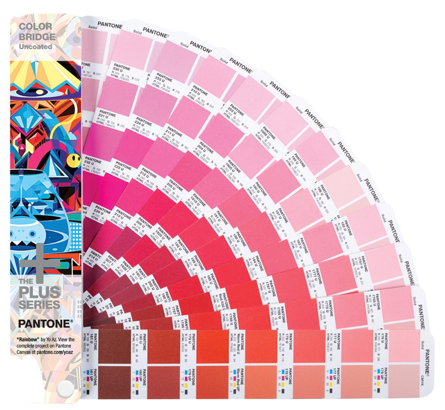
Back in the early 1960s, Pantone was a printing company in Carlstadt, New Jersey, with a specialty in color charts for the cosmetic, fashion, and medical industries. Lawrence Herbert joined the company in 1956 and noticed how difficult it was for designers, ad agencies, and printers to communicate—identifying exact colors from names alone is tough. For example, there are red-based purples and blue-based purples, warm and cool shades, lighter and darker tones. Mistakes happened, there were tons of inefficiencies due to reprints, and Herbert knew there had to be a better way to do things. He bought Pantone in 1962 and launched the first PMS guide in 1963 with 10 colors in an effort to reduce the number of variables happening in the printing process. Creating an objective, numeric language means that any printer anywhere in the world can accurately produce a color.
“Pantone is the industry standard,”
Michele Outland, creative director of Gather Journal
“It’s something that I automatically go to when
I need to choose a color. It prints really accurately.”
Picture a shelf of Coke bottles where every other label was a slightly different shade. Yes, they’re technically all “red” but they’re not the right red. This might make you think some bottles are less fresh than others; therefore the brand isn’t reliable. (You even might grab a Pepsi instead.) Real Coke bottles in New York are the same red as ones in London or Mexico City or Mumbai: Pantone 185. While Pantone doesn’t sell actual ink, it does specify how to mix the right proportions of CMYK to yield the color.

By the 1970s, Pantone sold over 100,000 chip books. Today, the company estimates the total number of printed books to be in the millions. Pantone has a firm grip on the graphics industry and is the most widely used color-matching standard in every country except Japan.
Read the full article here.