‘The right materials can take your work from good to great.’
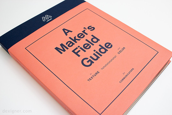
Mohawk Fine Papers has released a new print tool designed to serve as a hands-on resource for the creative community.
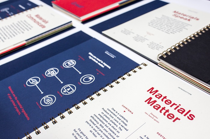
This comprehensive resource was created by Hybrid Design and will be the definitive guide to using texture and color to amplify printed projects, underscoring the importance of using materials as a powerful communication tool.
Designed to appeal to distinct audiences – printers and designers/communicators – the Maker’s Field Guide features customized wraps providing specific information to help each audience maximize its contents.
Content was developed to entice readers to consider new ways to select and use materials to maximize the power of print.
Materials – The power of materials as a key component of communication
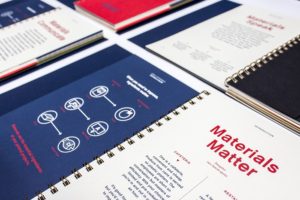
- Materials Matter: Materials are the ingredients of a printed project.
- Materials Speak: The way a paper feels is the secret power of a printed piece. Featuring a touch test to demonstrate how printed materials can convey unconscious messages.
- Materials Communicate: Through embodied cognition, our brains translate the feeling of touch into distinct emotions and impressions. Each material contains a message, making material selection increasingly important.
- Materials on Message: Like words, print and design, materials can be used to elevate a brand.
Texture – Time-tested strategies to get the most out of textured papers
- Match/Contrast Texture: Printed communications can be enhanced by matching or contrasting textured papers to content.
- Unify with Texture: Unify components of brand by using texture across all printed touch points will make every piece distinct and recognizable.
- Unlimited Possibilities: Texture elevates the tactility of printed communications, while also enhancing imagery, lending additional character to photography.
Color – Strategies to heighten the impact of printed projects by maximizing color
- Use Paper as the Fifth Color: Used with four-color printing, colored paper can become the star of the show or can be as impactful as the image/illustration itself.
- Enhance Photography: As a unique and often surprising layer of interest through the use of colored papers.
- Emphasize Materials: To make an elegant statement, let the materials do the talking through the use of a simple emboss, deboss or foil treatment.
- Transform with Color: Affect the mood of your design through various colored papers.
Resources
- Inspirational resources: Mohawk Maker Quarterly, Felt & Wire, Printed Samples
- “Ask Mohawk” Series: Paper Basics, Printing Basics, Envelope Basics
- Tools: Mohawk Swatchbooks and Mohawkconnects.com
‘The competition to command an audiences’ attention has risen to a fever pitch.
Audiences are overwhelmed, bombarded with more-more-more, with less and less
impact. What we make needs to matter, to make an impression, to elevate itself from
the endless churn of communication.”’explains Dora Drimalas, principal of Hybrid Design.
The Maker’s Field Guide features a wide array of printing techniques including offset printing, foil stamping, and embossing processes on 32 distinctive colored and textured papers drawn from nearly every Mohawk paper grade, including:BriteHue, Carnival, Via, Loop, Options, Superfine, Strathmore and Via, as well as papers from The Curious Collection.
[vimeo height=”360″ width=”640″]https://vimeo.com/172455352[/vimeo]
Learn more at Mohawk Paper at https://www.mohawkconnects.com/makersfieldguide