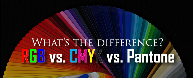
There are three common ways to specify color for use in traditional offset printing and for on screen viewing.
- RGB
- CMYK
- Pantone (PMS)
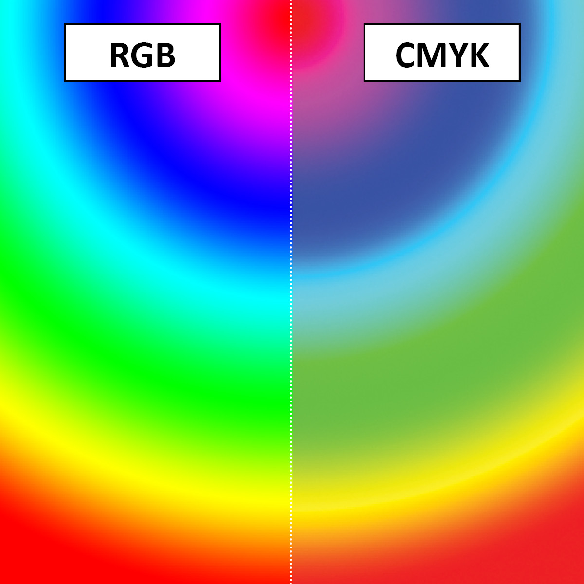
RGB colors are called “additive colors” because an individual color is created from nothing by adding different values and intensities of each primary color. When all three primary colors are combined at their maximum intensity, you see white.
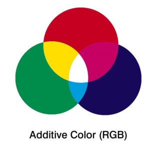
The main purpose of the RGB color model is for the sensing, representation, and display of images in electronic systems, such as televisions and computers.
RGB is a device-dependent color model: different devices detect or reproduce a given RGB value differently, since the color elements (such as phosphors or dyes) and their response to the individual R, G, and B levels vary from manufacturer to manufacturer, or even in the same device over time. The same RGB color value will look different across different monitors and in different viewing conditions.
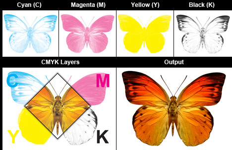
CMYK colors (cyan, magenta, yellow, black) are subtractive. This means that a CMYK color starts with all the colors, and when the colors are subtracted, you end up with black.
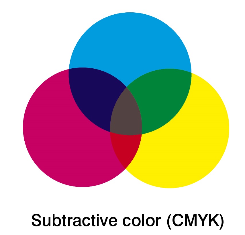
Offset printing doesn’t work with RGB. Instead it uses CMYK or Pantone Inks. CMYK Printing (also called four-color process) uses a combination of 4 inks (cyan, magenta, yellow and black) to create the image.
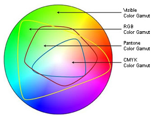
CMYK has a smaller gamut than RGB, which means that there are some colors you can specify in RGB (especially some of the popular bright ones) that don’t have a corresponding CMYK color.
The best way to see the color differences between the CMYK and RGB color spaces is to look at a color gamut comparison chart. You can see that in some areas the RGB color space is “outside” that of the CMYK space. It is these colors that will be affected by a conversion from RGB to CMYK.
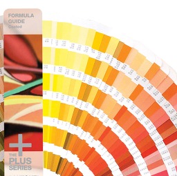
The Pantone Matching System (PMS) is standardized reference guide with more than 1000 solid colors. There are swatch books showing how those colors will print on coated, uncoated and matte paper. The swatch books are a universal standard for specifying color when speaking with printers.
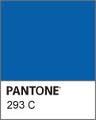
If your color is specified as “PMS 293C” (the C means coated) then anyone with access to the Pantone swatch books can look that up and see the shade of blue that is to be printed. Just like you would go into the paint store and get a can of paint made to match that paint chip, printers will purchase/make ink to the formula for the PMS Chip.
So what does all this mean for you?
Ideally, when getting your corporate identity done you will be given all three systems for your colors – RGB, CMYK and PMS. Keep in mind that each system is different and it’s not always possible to have the color look exactly the same printed PMS vs. CMYK vs. RGB.
- RGB – use for viewing things on screen – web, pdf, powerpoint
- CMYK – use when printing documents that need to have full color
- PMS – use for your logo and other branded items where you want a consistent color.
If you are choosing Pantone colors, then it pays to consider how those colors will look done in CMYK (and Pantone provides a “bridge” swatch book that shows how this works). If you are reviewing your corporate colors onscreen or via inkjet prints that may not be giving you a realistic impression of how your colors will look when printed CMYK/Pantone (for Pantone the printed Pantone swatch books are the gold standard of how the color will look when printed and you can have your printer do what’s called an ink drawdown to see how your Pantone color will look on a specific paper and for CMYK you might want to get what’s called a Digital Proof from a local offset printer since to some extent CMYK printing can make your colors a bit duller/muddier).