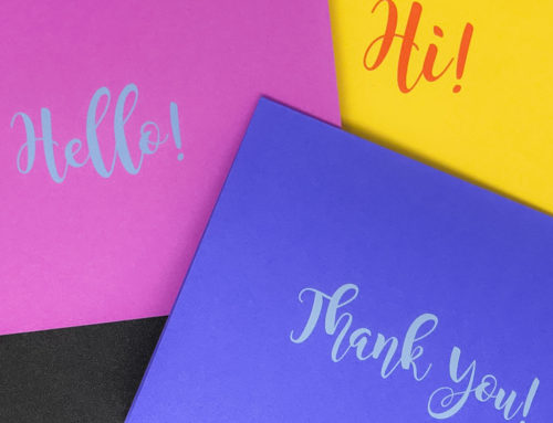
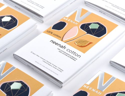
You ever receive a business card that’s on cheap paper? That feels thin and flimsy, and… wilts? We all have. Remember the subtle, subconscious feeling of disappointment? What a missed opportunity that was for them to convey their quality and prestige? First impressions matter, and for a few lousy cents per card, perhaps an extra couple bucks a year, they could have conveyed a dynamic, high-end impression to every single person and prospect they met, all year.
Your logo and business card are the tangible, physical embodiment of your entire law practice. If your card implicitly says “Mediocre,” “Cheap,” or “Boring,” it’s just a little bit harder to prove that you’re high-quality and creative. Why take the chance? Would you trust your money to a bank that saved a few pennies on the paper on its executives’ cards? Would you hire a law firm to handle a crisis if their cards seemed to be designed by Kinko’s? Maybe. But maybe not.
For full article visit Fishman Marketing


